SKY UX Design System
Background & My Role
Sky UX is Blackbaud’s design framework that allows designers and developers to leverage common information architecture standards, components, and style guidelines when prototyping or coding. The dedicated Sky UX team owns and maintains the design system, but everyone is welcome to contribute. The design system is open source and can be found at https://developer.blackbaud.com/skyux/
I audit our products to make sure we’re keeping up to Sky standards, create new component designs & write component guidelines, and gather feedback on how we can continue to improve and grow our design framework.
The Sky UX Process
Some of the Components & Guidelines I’ve Contributed
Avatar
To better identify their records, and to add a little visual flair, users can set avatars for their records (constituents, events, funds). These can either be an image or will default to the initials of the record.
https://developer.blackbaud.com/skyux/components/avatar
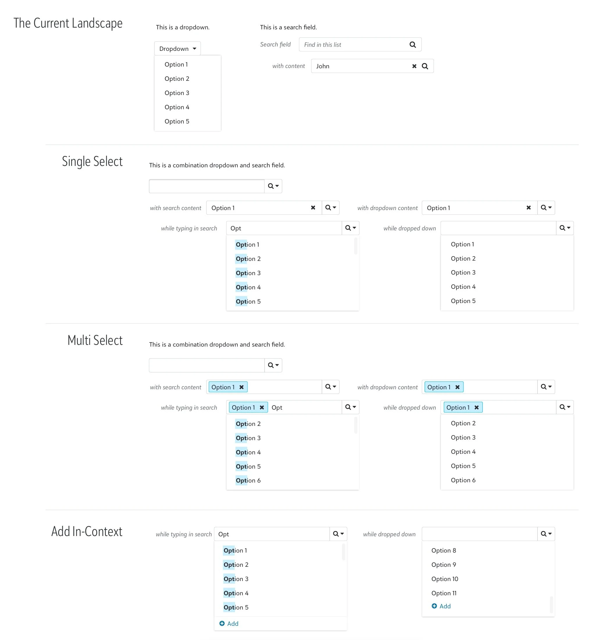
Sky Combobox
New component work in progress! We currently have a number of different options that solve similar selection needs, but they can be confusing for users, don’t always obey accessibility requirements, and may take the user out of the context of the form they’re in temporarily.
The Sky combobox eliminates these issues by combining needs in an elegant way - and has tested well with users so far.
Autocomplete, Lookup, and Select Field
These are a few flavors of input for data entry - as the user starts to type in the field, the field begins filtering results and displays them in a preview pane below. Different user needs and contexts have contributed to having multiple slightly different versions of these controls.
https://developer.blackbaud.com/skyux/components/autocomplete
New guidelines template
I’ve worked with the dedicated Sky UX team to provide feedback and iterate on what information we show in our guidelines & how to display it. Instead of a quick demo and jumping into the code, we’re in the process of revising guidelines to:
demo the design element in realistic contexts
go into a deeper dive of what makes up a design element
outline when to use the specific design element vs alternatives
show behavior and states of the element in multiple contexts
give more responsive design and accessibility information
include all components (including those not yet built) in our Sketch library
call back to our overall design principles and high level UI guidelines
Check out https://developer.blackbaud.com/skyux/components/radio for an example of what the new guidelines template looks like.
Onboarding patterns
Another work in progress! I’ve been collaborating with several other designers to outline a framework for onboarding in different scenarios:
opting in to pre-release testing on a specific feature
opting in to try a newly released feature
opting in to try a new product suite
These scenarios all require a slightly different touch, but should follow a holistic, recognizable pattern to keep users’ trust.


